Blog
After looking at the Inbox Placement Benchmark in the last article, I would like to take a closer look at the combined trend charts in the statistics section in this article. A few weeks ago, we published the latest version of the Certification Monitor. This update includes the following points:
- Benchmark – Deviation Inbox Placement – allows you to compare the deviation of the inbox placement rate to the previous day with all other certified senders
- Combined trend graphs – shows two KPIs simultaneously, making it easier to identify and analyse correlations
- Anomaly detection – shows the deviation of the inbox rate and Spam Complaint Rate to provide an indicator of improvement or deterioration
- News – informs about news and updates
- Alert management – reports can be activated here via email or webhooks
- Updated user profile – individual management of global alerts is now possible
In the past, it was already possible with the Certification Monitor to view the most important KPIs such as Email Volume, Spam Complaint Rate or DKIM Missing. Previously, this was only possible individually. Following the April update, it is now possible to view the most important KPIs in combination with the sending volume in the corresponding period.
This enables users of the Certification Monitor to recognise correlations much more quickly and draw conclusions for the future.
Email volume & complaint rate:
The Spam Complaint Rate is the aggregated and calculated rate based on the individual spam complaints received from users in relation to the volume.
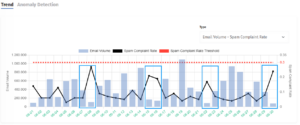
In the example above for June, you can see that the Spam Complaint Rate regularly rises at the weekend and comes close to the CSA threshold of 0.3%. Thanks to the combined graphs, the explanation is quickly found: The Email Volume drops on these days. However, as complaints are often received with a delay of 1-3 days, they are then met with a lower volume and result in a significant increase in the complaint rate. As these fluctuations cannot always be avoided and can be part of the email strategy, we always look at the average of the last seven days. In the case of particularly high-volume special campaigns (e.g. general terms and conditions mailings), the sender can consider spreading the volume over several days.
Email volume & spam traps
The Spam Trap KPI widget contains all aggregated spam trap hits from mailbox providers and spam trap networks. We do not receive any further details and do not differentiate between recycled and pristine spam traps.
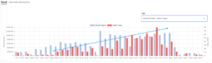
In the second example, a sender used the CSA Certification Monitor to observe a parallel increase in spam trap hits since mid-May in addition to the increase in email volume. This enabled the sender to recognise a quality problem and possible reputational risk. This analysis helped to rectify the problem and adjust the volume by sender to a reduced list of better- quality addresses.
Email Volume & DKIM Missing
The most common reasons for DKIM errors are missing DKIM keys or an incomplete copy & paste of the public key, especially when sending platforms leave the DNS management to their customers.
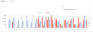
In this third example, the sender recognised that an error had crept into their DKIM setup at the end of December. Missing or incorrect DKIM signatures can lead to filtering by some mailbox providers and should therefore be avoided. Thanks to this quick overview, the sender was able to determine that nothing serious had changed in their mailing volume, but that only the DKIM setup needed to be checked.
Conclusion
The combined trend graphs help to recognise anomalies in the KPIs more quickly and identify the responsible shipping domain. This makes it possible to take measures to improve deliverability.
And that’s exactly what our tool is designed to do: quickly and easily prepare existing data so that the next steps can be recognised immediately.