Blog
[Guest Post] Decoding Email UX: The Science of User Attention
In today’s fast-paced digital world, capturing and maintaining user attention through email is both an art and a science. Since email remains one of the most direct and personal ways to communicate with an audience, understanding the user experience (UX) of these interactions is crucial. This article explores the science behind user attention in emails, offering insights into how to create more engaging and effective email campaigns.
The Attention Economy in Email
In an environment saturated with content, capturing and maintaining user attention is incredibly challenging. Research from Litmus shows that the average time spent reading an email is only 9 seconds. This brief window of attention underscores the importance of designing emails that are not only visually appealing but also strategically structured to guide the user through the content efficiently.
In the attention economy, every second counts. The design and content of your email must work in unison to deliver value swiftly. This involves a deep understanding of how users interact with emails—from the moment they open it to the critical decision to click through.
The Journey from Open to Click
When an email is opened, the user goes through 3 stages in their interaction: Load, Scan, and Act. These stages describe the user’s journey as they process the content of the email:
- Load:
- Loading Speed: A slow-loading email can significantly reduce engagement. Just as with websites, users expect emails to load quickly, especially on mobile devices. Ensuring that the total email size, including all hosted images, remains lightweight (ideally under 500 KB) is crucial for faster loading.
- Optimized Accessibility: Accessibility is key to ensuring that all users can interact with your email content effectively. This includes optimizing images with ALT text and ensuring that the HTML code is compact (ideally under 102 Kb) to avoid issues like truncated messages in Gmail.
- Scan:
- First Impressions: Within the first 50 milliseconds, users form an impression of your email based on its design. This impression is critical, as 94% of internet users base their first judgment on design. Therefore, an email’s visual appeal must be immediately apparent.
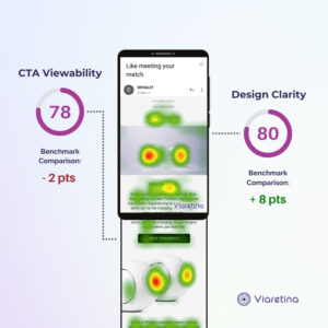
- Visual Hierarchy: The structure of your content will dictate how effectively users scan and understand your email. Using tools like predictive eye-tracking, it’s possible to model how a user will navigate your email, ensuring that the most critical elements are seen first.
- Minimalist Design: Simplicity in design helps users focus on the key message without distraction. By reducing clutter and emphasizing important content through visual hierarchy, you make it easier for users to digest information quickly.
- Act:
- Call-to-Action (CTA): The ultimate goal of any email is to encourage the user to act, whether it’s clicking a link, signing up for a service, or making a purchase. The placement, size, and wording of your CTA are pivotal. It should be one of the most prominent elements on the screen, guiding the user seamlessly from interest to action.
- User Interaction and Mobile Considerations: On mobile devices especially, ensuring CTAs are thumb-friendly is essential. This involves ensuring that the clickable areas are sufficiently large and easy to interact with. Facilitating easy interaction on smaller screens can significantly improve click-through rates.
Leverage Science, UX, and Eye-Tracking
The combination of science, data-driven UX metrics, and eye-tracking technology offers a powerful toolkit for optimizing email campaigns:
- Predictive Eye-Tracking: This advanced technology simulates how users will visually interact with your email content. Leveraging artificial intelligence and large-scale user studies, predictive eye-tracking can accurately forecast where users’ attention will be focused. This method, evaluated to have 92% reliability by MIT, provides clear insights into how to position key elements to maximize engagement on both desktop and mobile screens.
- Data-Driven UX Metrics: Complementing predictive eye-tracking, UX metrics offer a data-driven approach to evaluating your email’s design and usability. This includes an assessment of visual design (ensuring that aesthetics are backed by objective data), usability (focusing on accessibility and ergonomics), and interaction design (enhancing user interface to improve interactions).

Brands like Mercedes-Benz, Bpost, Generali, and Orange have already benefitted from this ground-breaking methodology with the technology and expertise provided by Viaretina to maximize impact. By integrating these insights, Viaretina ensures that email campaigns are not only visually compelling but also strategically optimized to capture and retain user attention.
Conclusion
Understanding the science of user attention in email UX is essential for any brand looking to maximize the effectiveness of their email marketing. By focusing on key elements like loading speed, visual hierarchy, and effective CTAs, you can create emails that not only capture attention but convert it into action.
Bringing pragmatism and science into creative decisions is the key to making effective changes that drive better engagement and conversions.