Blog
In the last article, we took a closer look at the combined trend charts in the statistics section. The underlying raw data of the mailbox providers is not new, but the KPIs are now displayed in relation to each other. The anomaly detection is calculated based on the same existing mailbox provider data and makes it possible to visualise deviations in the inbox rate and the Spam Complaint Rate without directly publishing the inbox rate. A few weeks ago, we released the latest version of the Certification Monitor. This update includes the following features:
- Benchmark – Deviation Inbox Placement – allows you to compare the deviation of the inbox placement rate to the previous day with all other certified senders
- Combined Trend Graphs – shows two KPIs simultaneously, making it easier to identify and analyse correlations
- Anomaly detection – shows the deviation of the inbox rate and Spam Complaint Rate to provide an indicator of improvement or deterioration
- News – informs about news and updates
- Alert Management – Reports can be activated here via email or webhooks
- Updated user profile – Individual management of global alerts is now possible
In the trend graphs in the statistics section, you can easily observe the development of individual key figures. Typically, daily fluctuations in the inbox rate and the Spam Complaint Rates are completely normal. But how do I know whether these fluctuations are “normal” and match the usual sending behaviour or whether I should be worried? This is exactly where the anomaly detection helps.
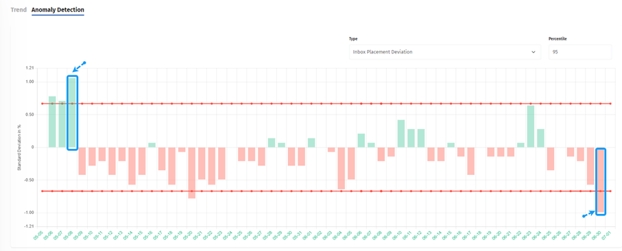
The anomaly detection chart provides an insight into the deviation of the selected KPI over a certain period of time. Green bars indicate an improvement in the KPI from yesterday to today, while red bars indicate a deterioration.
In addition, there is a red dotted line that represents the threshold value. All bars above the threshold line indicate anomalies where the KPI significantly deviates from its usual pattern. By default, the 95th percentile is considered, which can be adjusted as disired. This means that deviations with a tolerance of 95% can still be considered normal.
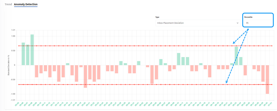
In this example, the customer should take a closer look at the mailings from 8 May and 30 June. On both days, the deviation in the mail delivery rate is greater than usual. The negative deviation in particular can be used to filter out possible bad senders. In contrast, the positive deviations can be used to draw possible conclusions for future mailings.
A simple click on the respective date in the diagram is all it takes to display the details for that day. These include From Domain, email volume, deviation of the inbox placement rate, Spam Complaint Rate as well as DKIM details.
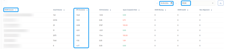
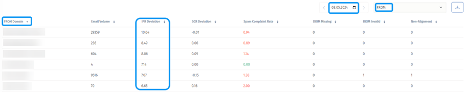
The details help to identify which sending domain may have had a particularly large impact on the anomaly.
If you wish, you can also download the data to prepare it for other purposes or to make it available to customers.
Conclusion:
Even though we are still unable to share inbox placement rates with our customers, the anomaly detection is extremely helpful in identifying significant deviations in sending behaviour. The graphical representation with green and red bars makes it possible to quickly recognise at a glance which sending days require closer examination. This saves time and focuses directly on the essentials.